Excel'de X ekseninde tarih ve saat içeren bir grafik nasıl oluşturulur?
Excel'de, genellikle veriyi daha iyi tanımlamak için bir grafik ekleriz. Ancak bazı durumlarda, bir dizi tarih ve saate dayalı olarak sütun/çubuk/çizgi grafiği oluşturduğunuzda, grafiğin X ekseni aşağıdaki ekran görüntüsünde gösterildiği gibi görünebilir. Bu makalede, grafiğin X ekseninde tarih ve saati doğru şekilde gösterme yöntemini anlatıyorum.

X ekseninde tarih ve saat içeren bir grafik doğru şekilde oluşturun
 X ekseninde tarih ve saat içeren bir grafik doğru şekilde oluşturun
Tarih ve saati doğru şekilde görüntülemek için, yalnızca Biçim Ekseni iletişim kutusundaki bir seçeneği değiştirmeniz gerekir.
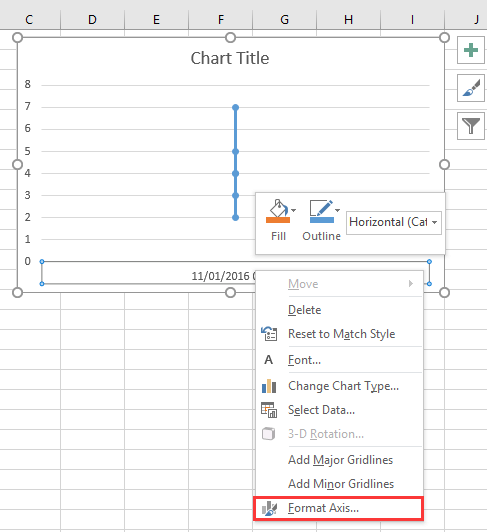
1. Grafiğin X eksenine sağ tıklayın ve seçin Biçim Ekseni bağlam menüsünden. Ekran görüntüsüne bakın:
2. Ardından Biçim Ekseni bölmesinde veya Biçim Ekseni iletişim kutusunda, Eksen Seçenekleri sekmesi altında işaretleyin Metin ekseni seçeneğini Eksen Türü bölümünde. Ekran görüntüsüne bakın:
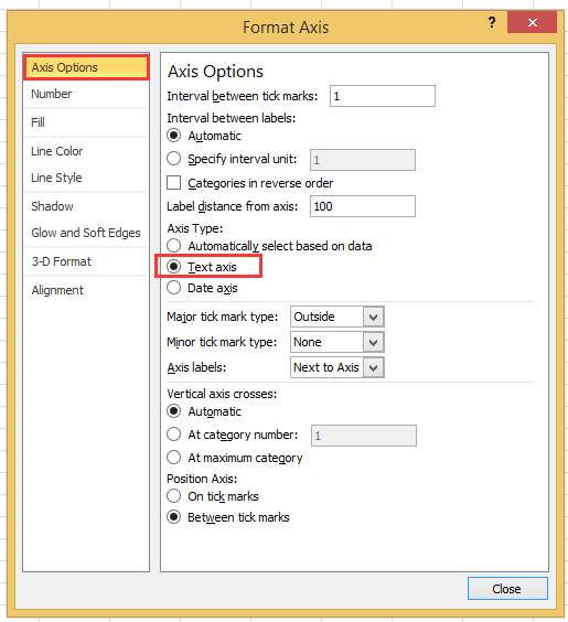
2010'dan sonraki Excel sürümlerini kullanıyorsanız, bir Biçim Ekseni bölmesinin açıldığını görebilir ve Eksen Seçenekleri grubundaki Eksen Türü altında Metin ekseni seçeneğini işaretleyebilirsiniz.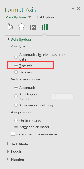
3. Tıklayın Kapat veya grafiğe geri dönün, ardından tarih ve saat verileri X ekseni üzerinde doğru şekilde görüntülenir. Ekran görüntüsüne bakın:

Sadece İki Adımda Bir Hız Göstergesi Grafiği Oluşturun! |
| Bir hız göstergesi grafiği kullanarak proje ilerlemesini göstermek istiyorsanız, bunu Excel'de oluşturmak karmaşık ve zaman alıcı olabilir. Kutools for Excel'in Hız Göstergesi Grafiği aracı bu süreci basitleştirir ve size profesyonel bir hız göstergesi grafiği oluşturmanızı sadece iki kolay adımda sağlar. Şimdi İndirin!. |
 |
En İyi Ofis Verimlilik Araçları
Kutools for Excel ile Excel becerilerinizi güçlendirin ve benzersiz bir verimlilik deneyimi yaşayın. Kutools for Excel, üretkenliği artırmak ve zamandan tasarruf etmek için300'den fazla Gelişmiş Özellik sunuyor. İhtiyacınız olan özelliği almak için buraya tıklayın...
Office Tab, Ofis uygulamalarına sekmeli arayüz kazandırır ve işinizi çok daha kolaylaştırır.
- Word, Excel, PowerPoint'te sekmeli düzenleme ve okuma işlevini etkinleştirin.
- Yeni pencereler yerine aynı pencerede yeni sekmelerde birden fazla belge açıp oluşturun.
- Verimliliğinizi %50 artırır ve her gün yüzlerce mouse tıklaması azaltır!
Tüm Kutools eklentileri. Tek kurulum
Kutools for Office paketi, Excel, Word, Outlook & PowerPoint için eklentileri ve Office Tab Pro'yu bir araya getirir; Office uygulamalarında çalışan ekipler için ideal bir çözümdür.
- Hepsi bir arada paket — Excel, Word, Outlook & PowerPoint eklentileri + Office Tab Pro
- Tek kurulum, tek lisans — dakikalar içinde kurulun (MSI hazır)
- Birlikte daha verimli — Ofis uygulamalarında hızlı üretkenlik
- 30 günlük tam özellikli deneme — kayıt yok, kredi kartı yok
- En iyi değer — tek tek eklenti almak yerine tasarruf edin